A Fresh, Consistent User Experience for JupiterOne
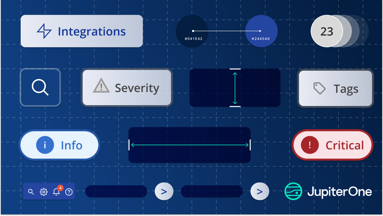
If you’ve logged into JupiterOne recently, you’ve probably noticed things feel different, in the best possible way.
That’s because we’ve been hard at work on improving the UX, giving JupiterOne a fresh new look that feels more natural, consistent, and modern.
On a recent customer call, a user put it perfectly:
“This feels like a really natural UI.”
That’s exactly what we set out to achieve.
Why the refresh?
Over time, powerful platforms like JupiterOne can start to feel a little fragmented. Features have grown in different directions and the experience started to feel less predictable.
Our vision is simple:
- Clarity over clutter so the most important information is front and center
- Consistency across the platform. No matter what area of the platform you are in, you know exactly where you are and where actions should be.
- A modern design language that feels right at home in 2025.
This isn’t about adding new features, but making sure the features you already use feel smooth, predictable, and above all, delightful to use.
What’s new
A modern, familiar experience
Brighter colors and reduced clutter give JupiterOne a fresher, more approachable feel from the moment you log in.
Predictable navigation everywhere
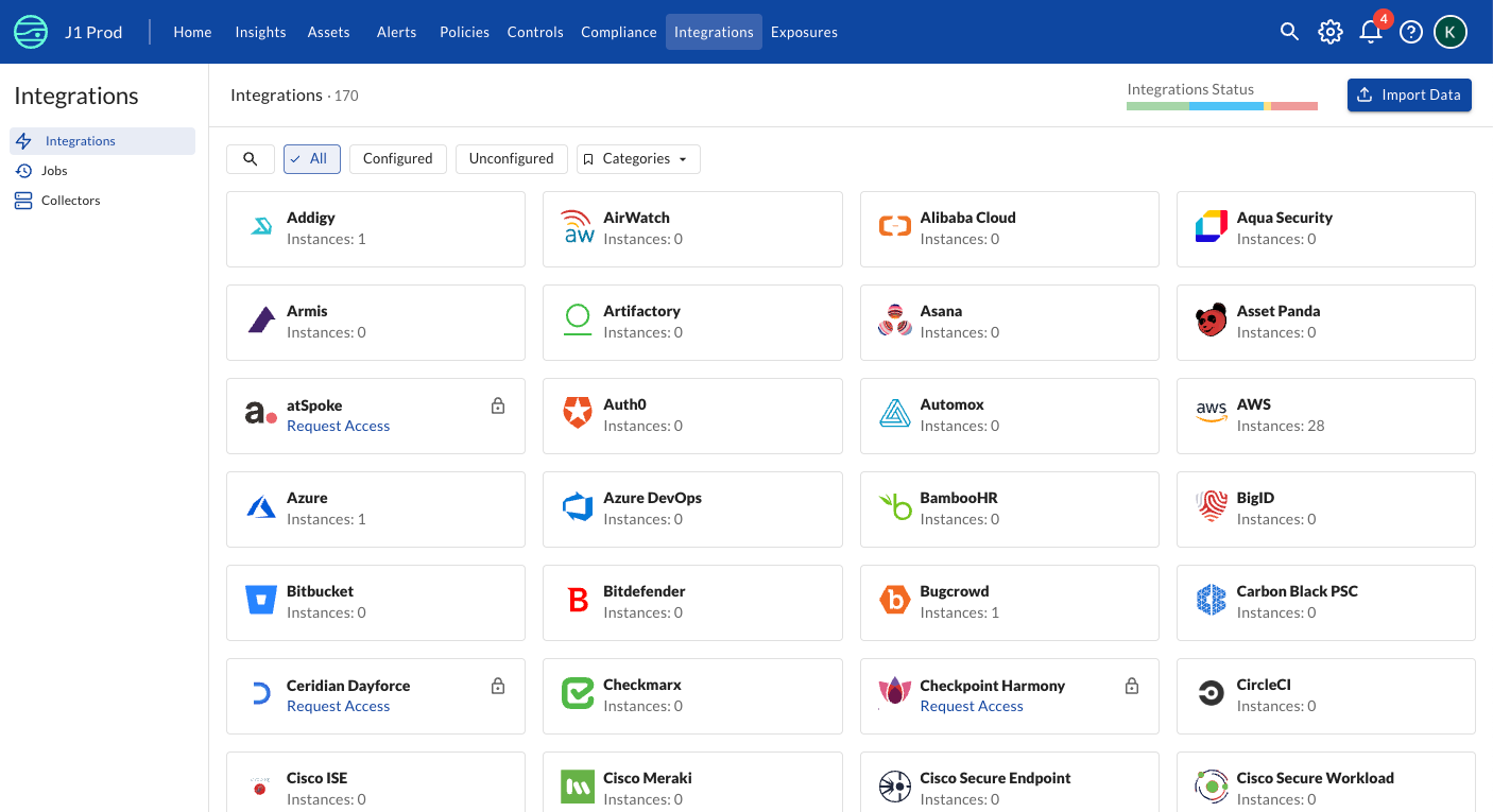
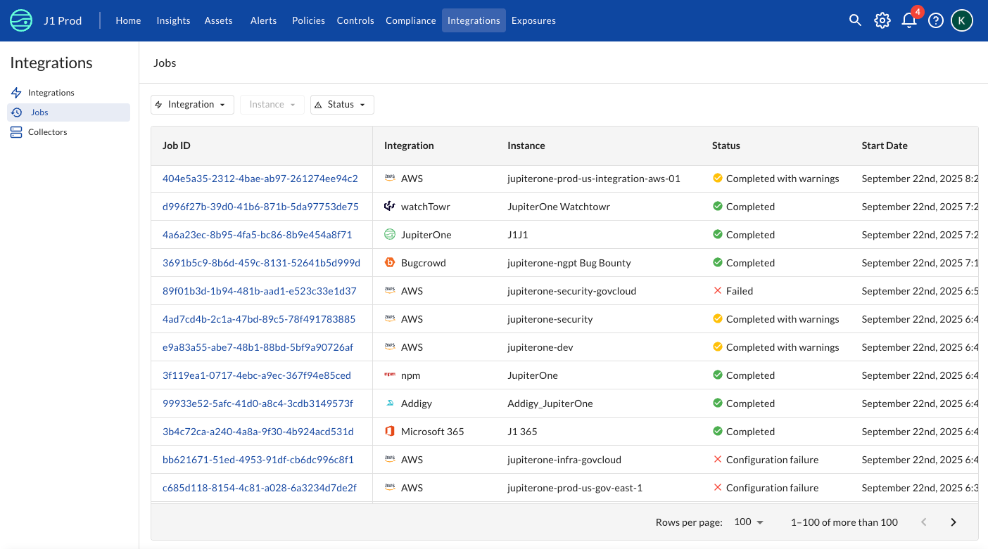
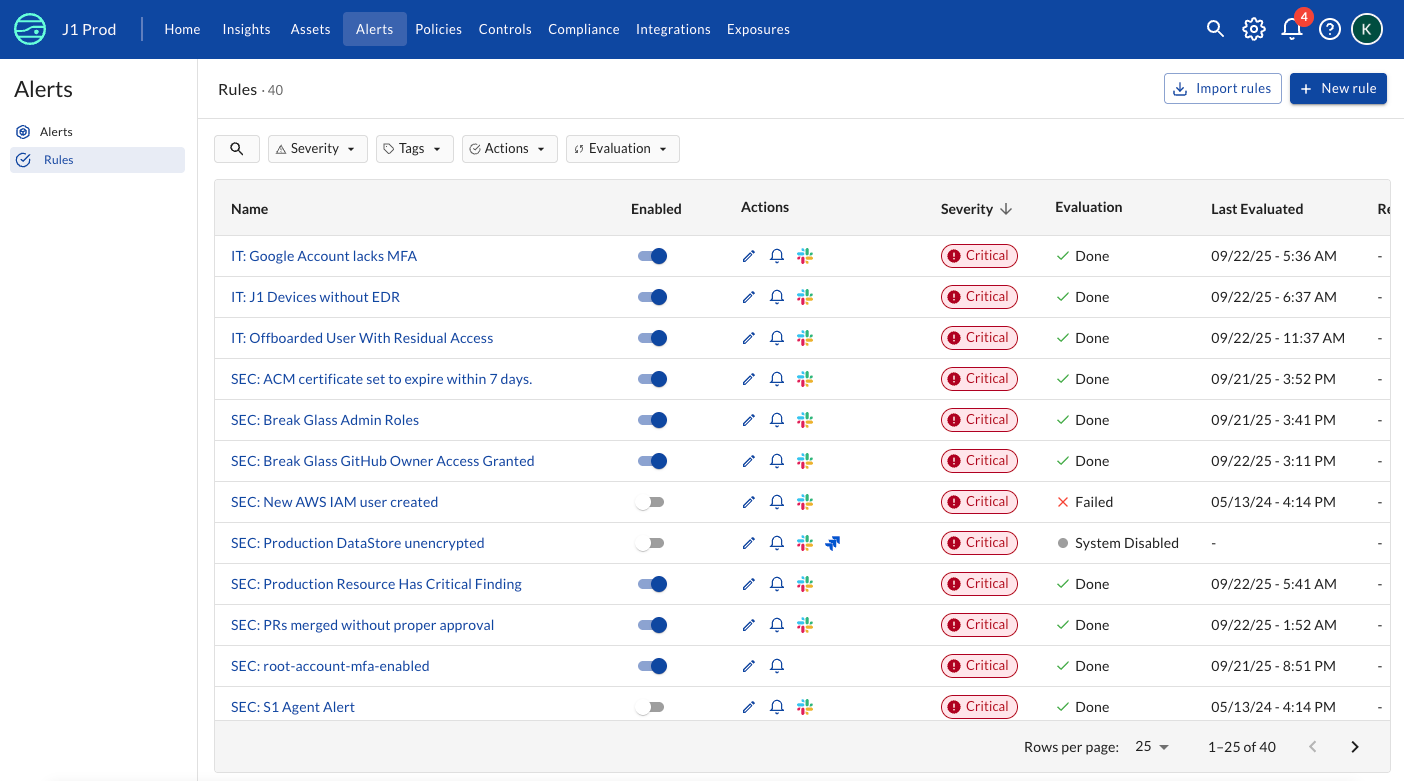
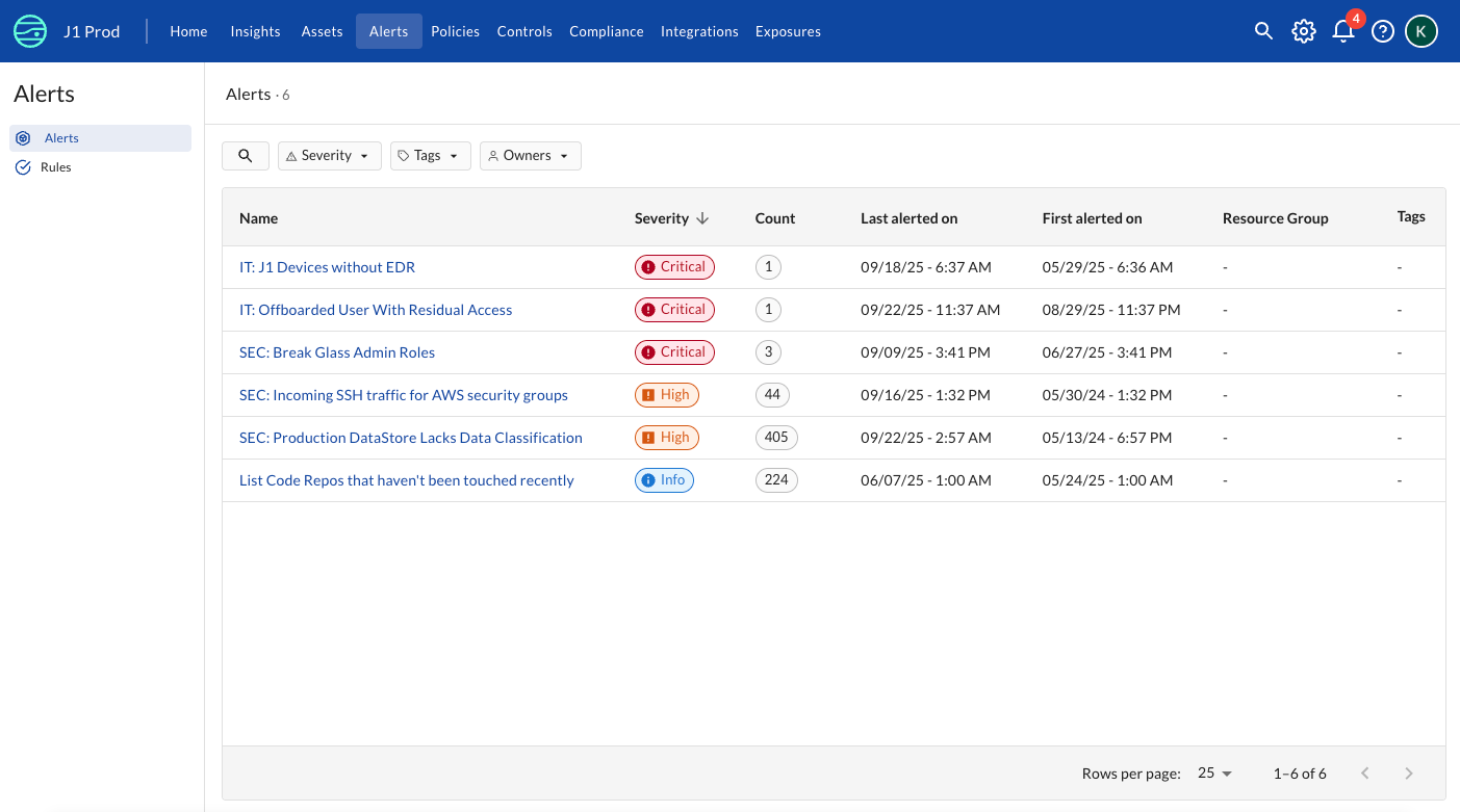
Breadcrumbs, navigation, and actions now follow a consistent pattern. Whether you’re in Alerts, Rules, or Integrations, the experience feels unified.
One pattern for filtering your data
Tables, filters, and sorting controls are now standardized across the platform. No matter where you are in our application, you’ll know exactly how to drill-down and find what you’re looking for.
Notifications that respect your focus
In-app notifications are cleaner, lighter, and handle multiple updates gracefully without interrupting your flow.
What’s next
Today’s refresh focuses on layout, navigation, and consistent patterns for filtering your data. Next, we’ll bring the same consistency to user flows like forms and dialogs, so the clarity you see now carries through every interaction.
A JupiterOne that feels like JupiterOne
At the heart of this initiative is a simple idea: JupiterOne should feel like one seamless experience, no matter where you are in the app.
By standardizing patterns, reducing cognitive load, and simplifying core concepts, we’re giving you more mental space to focus on what matters most – your security and operations.
The result? A platform that doesn’t just work—it feels right.